Create an Aesthetic Moodboard: Palette, Texture & Layout
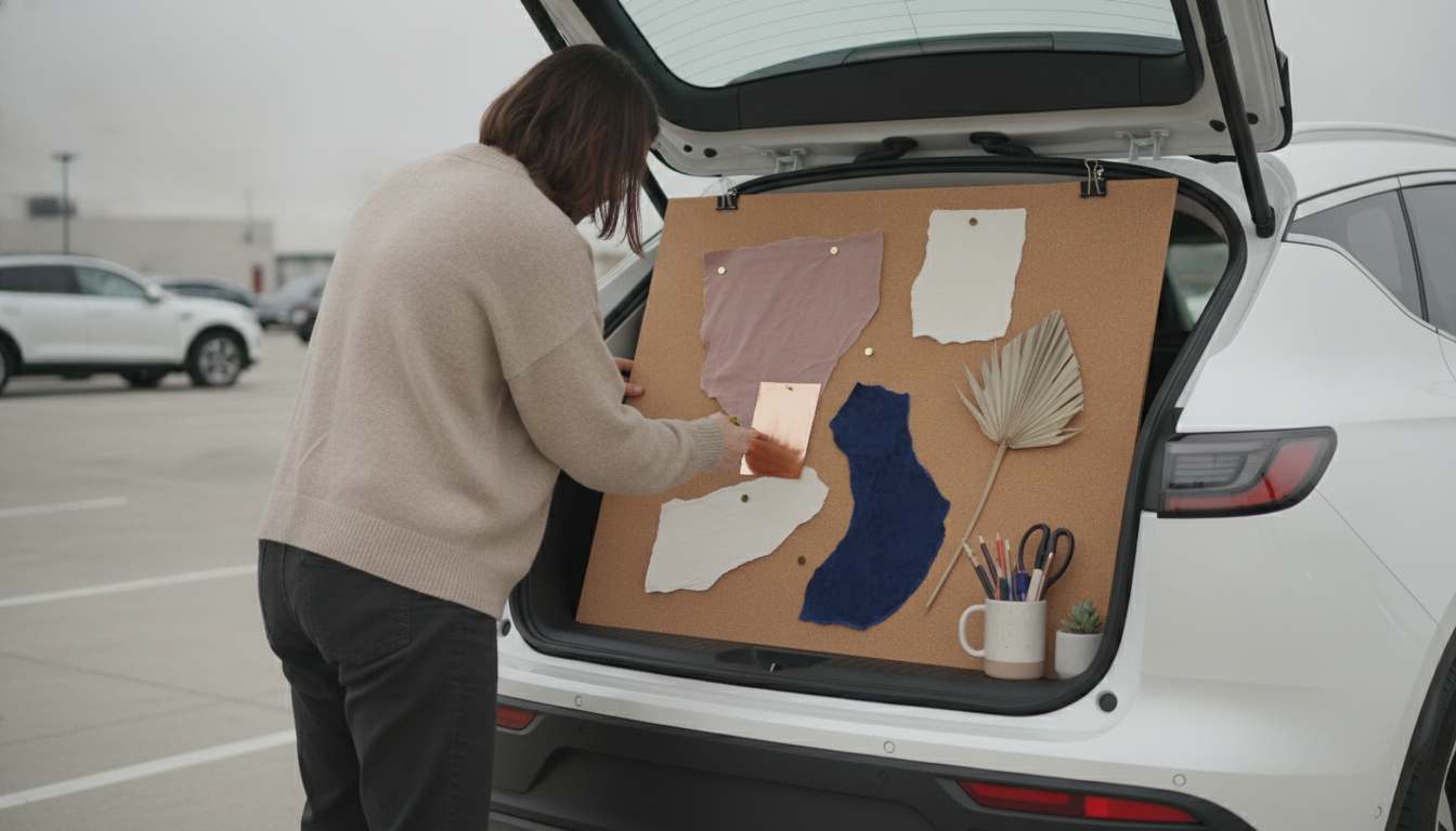
How to create an aesthetic moodboard?
An aesthetic moodboard is a quick way to turn a vague idea into a clear visual direction—whether you’re planning a room refresh, building a brand look, or mapping out a photoshoot. The goal is to collect images, colors, textures, and words that all “feel” like the same world.
1) Start with a purpose and a few keywords
Decide what the moodboard is for (home decor, outfit styling, wedding, product photography, etc.). Then choose 3–6 descriptors such as “warm minimal,” “coastal vintage,” or “soft monochrome.” These guide what you keep and what you skip.
2) Collect inspiration fast, then curate
Pull from Pinterest, Instagram saves, magazines, screenshots, or product pages. Aim for 30–60 pieces first. After that, cut it down to the strongest 10–20 that share common elements (lighting, color temperature, materials, shapes).
3) Lock in a color palette
Pick 3–5 core colors plus 1–2 accents. Look for repeated tones in your saved images (for example: cream, camel, muted olive, and matte black). If the palette feels scattered, remove images that introduce new colors without adding value.
4) Add texture, typography, and “real” references
Make it tactile: fabrics, wood grains, stone, metals, and patterns help define the vibe beyond color. If it’s for branding, add font samples and logo references. If it’s for a space, include specific product shots (a lamp silhouette, a tile finish, a chair shape) so the moodboard becomes actionable.
5) Arrange for clarity
Group by category: palette swatches, hero images, materials, and detail shots. Leave breathing room so the board reads instantly. If one image dominates the mood in the wrong way, resize it or remove it.
For a deeper walkthrough and examples, visit https://estalline.com/how-to-create-an-aesthetic-moodboard/.
FAQ
What should I include on a moodboard besides photos?
Include color swatches, material/texture samples, keywords, and a few concrete reference items (like a specific chair shape or fabric). These details help translate a “vibe” into decisions you can actually make.









Leave a comment